
GULU CITY UNVEILS NEW LOGO TO CEMENT CITY IDENTITY
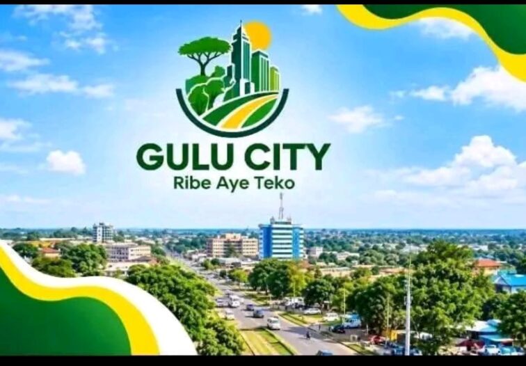
Proposed New Logo for Gulu City Under the Restructuring Process.
By Proscovia Achomo
Gulu City Council has unveiled a new corporate logo aimed at establishing a distinct institutional identity that reflects the city’s administrative status, cultural heritage and development aspirations, five years after its elevation from municipality to city status.
The new emblem replaces the logo previously used by Gulu Municipal Council, marking a significant step in the city’s efforts to align its official image with its current status and strengthen its identity as one of Northern Uganda’s major urban centers.
Speaking during the unveiling, Gulu City Mayor Peter Labeja Acire said the continued use of the former municipal logo had failed to reflect the city’s transformation, arguing that Gulu needed an identity that matched its administrative standing and future ambitions.
The mayor expressed concern that, despite attaining city status five years ago, the council had continued to operate under an identity associated with its former municipal administration.
“Right now, if you look at our identity, we are still living in denial and not really accepting our position and status as a city. The identity of this council has remained that of Gulu Municipal Council five years down the road. I feel that this council should do us justice by pronouncing itself and beginning our tenure with a complete identity,” Acire said.
The newly approved logo is expected to become the official corporate identity of Gulu City Council, featuring across the council’s branding, including official vehicles, staff uniforms, office signage, official documents and other institutional materials.
However, its rollout will begin after the proposed adjustments to the design have been addressed. Once the changes are completed, the council will be able to incorporate the emblem into its official branding and institutional operations.
The adoption of the logo is intended to establish consistency in the council’s public image, making it easier for residents, visitors, investors and other stakeholders to recognize official city institutions and communications.
Beyond its administrative significance, the new logo is also intended to communicate a shared sense of identity and belonging among the people of Gulu. By incorporating cultural symbols and development-related features, the council seeks to represent both the city’s heritage and its aspirations for the future.
The emblem carries the Acholi motto “Ribbe Aye Teko,” meaning _“Unity is Strength,”_ a message that underscores the importance of solidarity and collective responsibility among the Acholi people.
The motto reinforces the idea that Gulu’s development requires cooperation among residents, leaders, businesses and other stakeholders, particularly as the city continues to expand and respond to growing demands for infrastructure and public services.
The elephant, one of the key features of the logo, represents Acholi identity, providing a cultural symbol through which Gulu City expresses its connection to the people and heritage of the region.
The tree symbolizes nature, highlighting the importance of the environment, while the sun represents hope, reflecting optimism and aspirations for a brighter future for the city and its residents.
Roads and infrastructure depicted in the emblem represent development, underscoring the importance of connectivity and infrastructure in supporting Gulu’s urban transformation. Meanwhile, the carved hands symbolize unity and the collective efforts of the Acholi people, reinforcing the message that development depends on the participation and contribution of the wider community.
Together, these features connect Acholi cultural heritage with Gulu’s ambitions for growth and progress. The logo seeks to present the city as an institution rooted in its cultural identity while looking towards a future shaped by development, cooperation and shared responsibility.
For residents, the new corporate identity offers an opportunity to strengthen civic pride and recognition of Gulu’s city status. Its adoption across public offices, official vehicles, staff uniforms and council documents is expected to provide a consistent visual identity for the institution responsible for coordinating urban development and delivering public services.
Despite welcoming the new emblem, some council members have proposed adjustments to aspects of its design, particularly the colours used to represent the different features.
Laroo-Pece Division Councilor Morris Odong said the symbols selected for the logo were appropriate but questioned the use of green across the design, arguing that retaining the natural colours of some features could improve their originality and visual representation.
“Looking at the specimens proposed to embody the logo, they look beautifully nice, but my concern is that the designer of this logo should have considered the respective colours of the specimens, given their originality. For example, the elephant’s original colour should be maintained on the logo rather than throwing everything green,” Odong said.
His remarks highlighted the importance of balancing a unified corporate design with the authentic representation of the cultural and natural features incorporated into the emblem. Despite his reservations, Odong ultimately approved the logo.
The proposed design adjustments are expected to be addressed before the new emblem is officially rolled out across the council’s branding.
Meanwhile, Gulu City Deputy Mayor Ali Geoffrey, who also represents elderly men on the city council, welcomed the approval, describing it as a significant milestone following years of delays.
Geoffrey said the previous council had failed to approve the logo during its five-year term, expressing satisfaction that the current council had finally reached a decision within four months.
“We thank council for accepting to approve the council logo. It took a very long time, the whole five years for the previous council, and the logo was never approved. I am happy that in a period of four months, we have finally approved the council logo. That is a great achievement,” Geoffrey said.
The approval marks an important step in formalising the city council’s identity and moving away from the institutional branding associated with Gulu’s former municipal administration.
The new logo is expected to feature across the council’s official branding, including vehicles, staff uniforms, office signage, official documents and other institutional materials once the proposed changes have been made.
However, questions remain about the resources required to implement the new identity, including the cost of updating existing branding and the timeline for its full adoption. The cost of designing the logo and implementing the new branding was not provided during the announcement.
As the council prepares for the rollout, the significance of the new emblem will depend not only on its visual representation but also on how effectively it becomes a recognisable symbol of public service, cultural heritage, civic pride and shared responsibility among the people of Gulu.
The logo was unveiled during the council’s third council meeting, marking a long-awaited step towards establishing a corporate identity that reflects Gulu’s current administrative status and aspirations as a city.
Upcoming on 90.9 FM
Upcoming on 94.5 FM
Upcoming on 101.4 FM
Upcoming on 104.8 FM








Comments
This post currently has no comments.